Bookworm | Book Tracking App
Role | UI/UX Designer
Skills | Research, Problem Solving, Ideation, Competitor Analysis,
Wireframing, Prototyping, Usability Testing, & Visual Branding
Timeline | February ‘22 - March ‘ 22 (1 Month)
Tools | Adobe XD, Figma
Overview
The Context: Book lovers enjoy collecting books as trophies that remind them of all the books they’ve read and all those they look forward to reading but have struggled to find an app that offers them the same enjoyment and simplicity.
The Goal: Bookworm will exist as a native iOS & Android app that gives users a digital bookshelf to rate and record their books.
Competitive Analysis
The research requirements for this project called for analysis of 2 competitor apps. I chose Goodreads (which is an Amazon property) as it is the leading book app on the market and Libby which is my personal favorite book app but is really only utilizable for listening to and reading books.
Goodreads
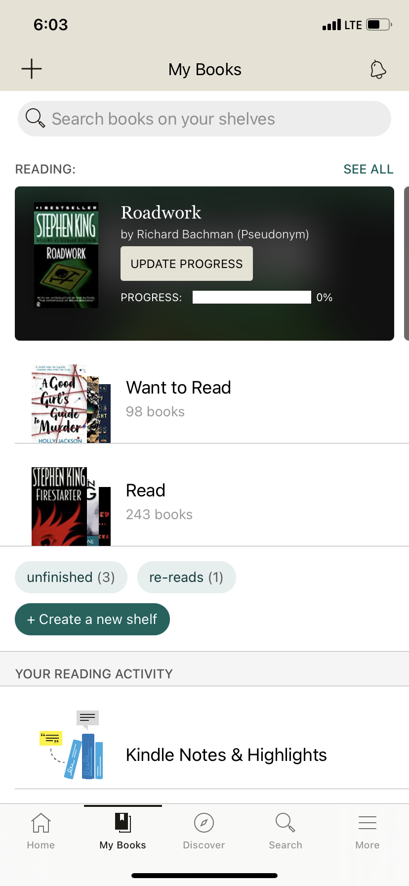
Great features for searching and tracking books. Improvements could be made to the drab color palette as well as the books suggested to users.
Libby
Beautiful layout that is easy to navigate but users are unable to track books they interact with outside of Libby.
User Stories & User Flows
Bookworm’s Key Features include Sign Up/Sign In, a strong search feature, a place to save books to be read, and a way for users to log and review books they have read. The following User Flows and User Stories designed with Figma highlight how users will utilize these features to achieve their goals.
“When I sign up for a book app, I want a personalized experience, so that I can quickly find new books to read”
“When I search for books, I want to filter the results, so I can peruse books that match my interests”
“When I finish reading a book, I want to be able to rate and log it, so that I can reference my preferences at a later time”
Wireframes
Utilizing both Apple’s Human Interface Guidelines & Google’s Material Design Guidelines I began working on Bookworm’s Wireframes using Adobe XD.
iOS
Search
Home
Logged Books
Book Details
Saved Books
Android
Search
Home
Logged Books
Book Details
Saved Books
Mid-Fidelity
iOS
Sign Up
Splash
Log In
Onboarding
Search
Home
Logged Books
Book Details
Saved Books
Onboarding process created that gives users the option to choose their favorite genre’s and influence suggested books
Colored tiles to differentiate genre’s in onboarding and search
Navigation Bar
Logo Font:
Permanent Marker
Android
Sign Up
Splash
Log In
Onboarding
Search
Home
Logged Books
Book Details
Saved Books
Green considered a soothing and relaxing color that will remind users of curling up with a favorite book in nature.
Navigation Bar
Book covers added
User Testing
What’s Working?
Font
Layout
Navigation
Tagline
What’s Not Working?
Color Scheme
“My Books” vs “Saved” is unclear
Need more search filters
High-Fidelity Mockups
iOS
Sign Up
Splash
Log In
Onboarding
Search
Home
Logged Books
Book Details
Saved Books
Onboarding tiles updated with literature images with green headers to indicate selected
Sample text added to input fields.
Book synopsis included on Home page and Book Details
Color removed from cards and Navigation Bar for iOS
Android
Sign Up
Splash
Log In
Onboarding
Search
Home
Logged Books
Book Details
Saved Books
Reflection
-
The most successful part of this design process was User Testing. Unlike previous projects, Bookworm was created without extensive initial User Research. Once my designs were released into the world for Users to assess I received an enormous amount of feedback that helped refine and reiterate Bookworm.
Skills:
Prototyping | User Testing & Feedback | Iterative Design
Processes:
User Centered Design
Solution:
Utilize User Testing throughout entire design process
-
My biggest challenge right now is the use of color within my designs. User feedback has helped me pair down my use of color throughout an app in order to create a more appealing and accessible visual design.
Skills:
Color Choice | Iterative Design
Processes:
User Centered Design
Skills Gap:
Color Theory | Accessibility
Solution:
Seek out additional reading as well as video tutorials focused on Color Theory & Accessibility in design
-
One of my biggest opportunities is expediting my work. This was the first project I began dabbling with Figma. Adobe XD has been my tool of choice and although it functions well in most aspects, there are times where its functionality is so lacking that I have to redo work to make it work the way I want it to.
Skills:
UI Design | User Flows | Prototyping
Processes:
Utilizing more industry standard design tools
Solution:
Continue learning Figma a piece at a time until I'm confident enough to make the switch entirely


